The following is a simplified overview of how a RED slope determines shared buffer availability on a packet basis:
The RED function keeps track of shared buffer utilization and shared buffer average utilization.
At initialization, the utilization is zero and the average utilization is zero.
When each packet is received, the current average utilization is plotted on the slope to determine the packet discard probability.
A random number is generated associated with the packet and is compared to the discard probability.
The lower the discard probability, the lower the chances that the random number is within the discard range.
If the random number is within the range, the packet is discarded, which results in no change to the utilization or average utilization of the shared buffers.
A packet is discarded if the utilization variable is equal to the shared buffer size, or if the utilized CBS (actually in use by queues, not just defined by the CBS) is oversubscribed and has stolen buffers from the shared size, lowering the effective shared buffer size equal to the shared buffer utilization size.
The new shared buffer average utilization is used as the shared buffer average utilization next time a packet probability is plotted on the RED slope.
When a packet is removed from a queue (if the buffers returned to the buffer pool are from the shared buffers), the shared buffer utilization is reduced by the amount of buffers returned. If the buffers are from the CBS portion of the queue, the returned buffers do not result in a change in the shared buffer utilization.
The following figure shows how a RED slope is a graph with an X (horizontal) and Y (vertical) axis. The X-axis plots the percentage of shared buffer average utilization, ranging from 0 to 100 %. The Y-axis plots the probability of packet discard marked as 0 to 1. The actual slope can be defined as four sections in (X, Y) points.
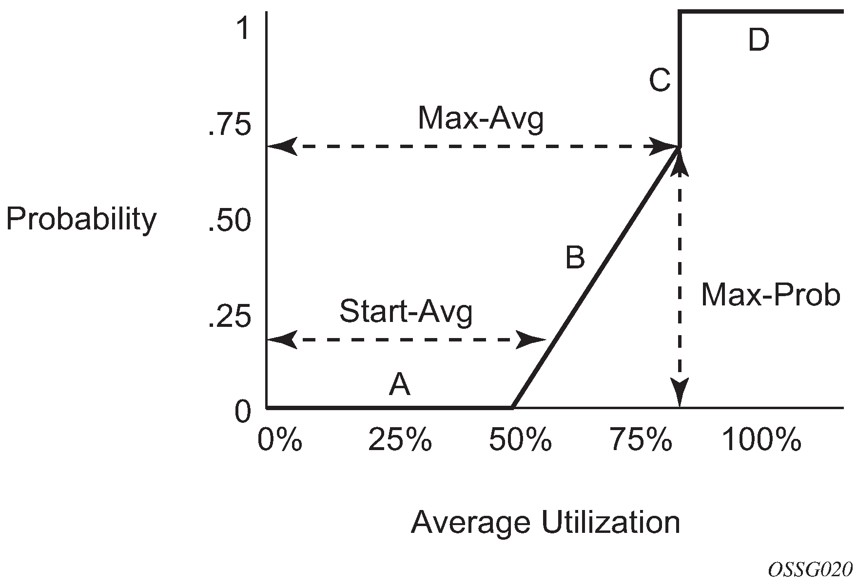
The following describes the sections shown in the preceding figure:
Section A is (0, 0) to (start-avg, 0). This is the part of the slope where the packet discard value is always zero, preventing the RED function from discarding packets when the shared buffer average utilization falls between 0 and start-avg.
Section B is (start-avg, 0) to (max-avg, max-prob). This part of the slope describes a linear slope where packet discard probability increases from zero to max-prob.
Section C is (max-avg, max-prob) to (max-avg, 1). This part of the slope describes the instantaneous increase of packet discard probability from max-prob to one. A packet discard probability of 1 results in an automatic discard of the packet.
Section D is (max-avg, 1) to (100%, 1). On this part of the slope, the shared buffer average utilization value of max-avg to 100% results in a packet discard probability of 1.
Plotting any value of shared buffer average utilization results in a value for packet discard probability from 0 to 1. Changing the values for start-avg, max-avg, and max-prob allows the adaptation of the RED slope to the needs of the different queues (for example, access port queues) using the shared portion of the buffer pool, including disabling the RED slope.